Tuesday, 3 September 2013

A thousand words

Richard Eccles, editor of Cumbria Life, knows the county's people and landscape are core of his magazine. The drama of the Lakes and stories of its people are played out in the pages of his magazine each month.

For the redesign Richard was keen to introduce a regular photo feature telling the story of a unique Cumbrian event through the eyes of staff photographer Phil Rigby.

I've not come across many editors who are prepared to devote space to a photo essay. But the 10 or so pages Richard hands over to Phil each month is a reflection on the beauty of the county and how important it is to the magazine's identity.

Phil has been working for CN Group, the owners of Cumbria Life, since 1988 starting out in newspapers and then moving over to work in the magazine division.

I asked Phil how he approaches a photo essay

"I like to try to shoot differently to the rest of the magazine and a photo story gives me more freedom to experiment. I prefer not to have any fixed ideas but I do know what I want to avoid, which is cliched pictures that have been done before. A recent example was a photo story of a blacksmith at work in her forge - I knew I didn't want to come back with a picture of the blacksmith making sparks, which has been done many times."

"I like to let the shoot develop naturally. It's important not to rush but also not to drag the shoot out - that really puts people off and you soon lose their attention. I like to keep it fun and am always on the look out for little angles and picture ideas that occur during the shout."

"The best way to get the shots you want is to keep everything as natural and relaxed as possible. Some shots are 'catch the moment' pictures but there are also photos which occur to me which I will take time to set up. With these, I see what I want to capture in my mind's eye beforehand."

"I always hope the pictures will be interesting and stimulating. I want them to be 'take you there' photos that will give readers an insight into a place or an activity that they know nothing about"

The first set of 4 spreads capture the drama, colour and characters of Appleby Horse Fair


The next set of spreads tell the story of Lucy Sandys-Clarke, who specialises in traditional forge work from her smithy in the village of Dent 


Cumbria Life redesign

Cumbria Life gets a new look and logo 

Cumbria Life is one of three titles that makes up the magazine arm of Carlisle based, newspaper publisher, CN Group.

Richard Eccles, Publishing Director in charge of the magazine portfolio, asked me to work with him on the relaunch of Cumbria Life and oversee the design of the new look, including a new logo and complete rethink of the way the content is presented.

A previous designer had let Richard down, so he was looking for someone else to take up the challenge. I'd recently joined PPA Scotland and Richard spotted my name when I was introduced in the PPA newsletter.

Cumbria Life aims to be a vibrant and contemporary guide to life in Cumbria without losing its core values centred around the Lake District’s beautiful landscape and heritage.

Richard Eccles, said: “We felt it was time to refresh the magazine and change perceptions about what a 'county life' magazine is about. We want to be essential reading and an essential guide for getting the most out of this amazing county and its unique combination of natural beauty and a vibrant contemporary culture of Michelin-starred restaurants and a thriving arts scene.

"The challenge is to attract new younger readers while not putting off our traditional core, and from the first reactions to the new magazine, I think we have pulled it off."

"Readers are connected by a deep closeness to the geographical community rather than just a common lifestyle interest such as music or motorbikes. This brings extra complexity and to the editorial process for a regional magazine, similar to the difference between local and national newspapers - particularly for example in terms of how far you stretch cover lines. The people and places featured are our neighbours."

"I'm delighted with what Matthew has brought to Cumbria Life, not just design but the whole approach of how a magazine works best. In terms of regional magazines I think there's now nothing like Cumbria Life in the UK."

Broadcaster Stuart Maconie, who has a home in the Lake District and has been a columnist on the magazine for five years, told Richard: "The new Cumbria Life is ace - it makes the others I've seen recently look like vapid county set advertorial fests. I see a lot of county magazines on my hotel travels and Cumbria Life is like the New Yorker by comparison...but with just enough sheep and drop scones to 'keep it real'. It's a proper magazine with proper design, ideas and proper writing."

The photography took centre stage in the redesign, more care is taken with photo editing so fewer images are used to tell a story  - but they're bigger. You can't help build 'flick-stopping' pages with such dramatic photographs of the Lakes.

Staff photographer Phil Rigby's portrait and landscape shots are used through out the magazine and are the backbone of the new design.

The magazine was officially relaunched at a party in Grasmere. Special guest speaker was Kevin Roberts, the worldwide chief executive of Saatchi & Saatchi, who has a home in Grasmere and has featured in the magazine. He spoke of his love for Cumbria and said that Cumbria Life was the first thing he turned to whenever he arrives in Grasmere.

I also worked closely with commissioning editor Mary Ingham and Sara Valentin and Lindsay Molloy on the production team.


Opening spread to the news section


News spread


Opener to life style section


Thursday, 29 August 2013

Give us a wave

The Summer issue of the award winning member magazine for the National Clarion Cycling Club will soon be landing on 1500 doormats across the UK.

The latest issue of Boots&Spurs features an interview with the Bury Clarion alumni and world champion Simon Yates, exclusive tips for youth riders from Sir Chris Hoy, how Gustave Holst may have cycled with the Clarion and the usual club news from around the country.

Garry Marshall's wrap-around illustration features on the cover.


Monday, 5 August 2013

Scotland in Trust: "Interesting, attractive and modern"

The redesign of the National Trust for Scotland member magazine has had a good reaction from its readers, many have tweeted positively about the new look:

"Love new look @N_T_S mag. Grt piece on rural life museum. 1 of my toddlers fave places to visit. Well worth a trip - lots to keep kids happy"

"@N_T_S great photos on the farm at NMS Rural Life! :) the whole publication is v visually stimulating"

"@N_T_S magazine is infinitely better, interesting, attractive and modern. Good work!"

Here are a few pages form the latest (Summer) issue that I designed on behalf of Think Publishing with editor Clare Harris


Rocking all over the South West

The Summer issue of Escape is now available on trains all across the First Great Western network.

The latest issue of the passenger magazine includes a musical map of rock and pop hotspots, where to get action adventure thrills and a round up of the best new musicals.

I design the magazine on behalf of Think Publishing


A greasy tippet, a dimpling rise and Roger Daltrey

It's great fun designing Fly Fishing and Fly Tying's covers.

We've used Henry Gilbey's evocative fishing photos for the last couple of issues and the magazine has had some excellent features over the summer. Roger Daltrey's fishing lakes (and how to fish them), how to fish a spate river and whether or not to grease your tippet (new research says you shouldn't!) are just a few

Slimy Sue Damsel, Wet Olive, Parton's Diamong Dog, the fly names are really expressive, so name checking them on the cover helps to get across the idiosyncratic approach of this wonderful magazine.


Wednesday, 3 July 2013

Vitamin C overdose

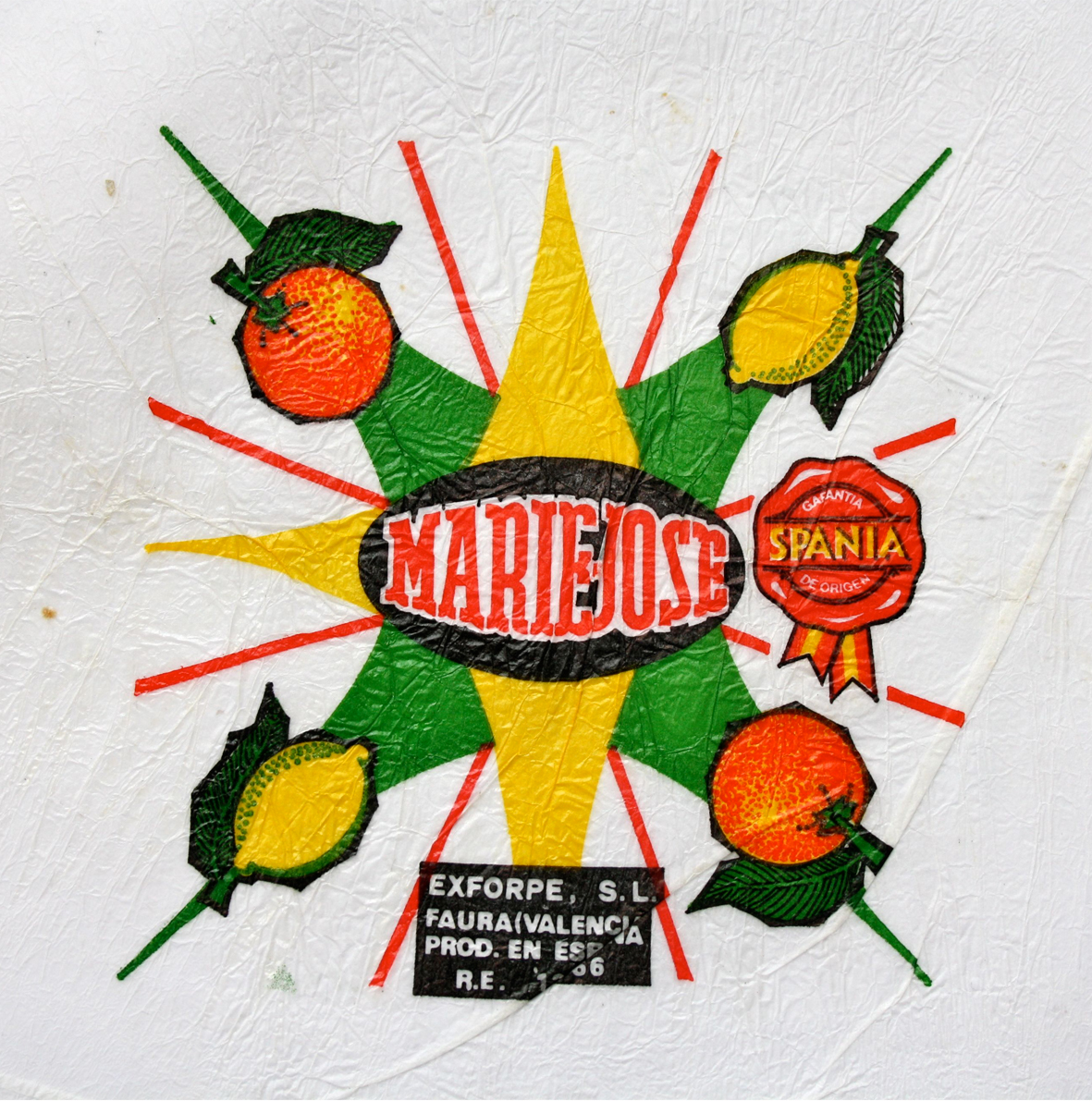
I've just rediscovered a collection of tissue orange wrappers I used as research for a student type design project. They were collected while on a trip to Barcelona's La Boqueria market.

The designs are printed using a rubber plate so as not to damage the tissue. The printing quite often goes out of register so each wrapper is slightly different

I have about 30 wrappers which compared to Eric Bradshaw's collection of 2,797 is a drop in the ocean.

Have a look at those I've uploaded, I like the way the printing glitches, and simple design coexist to produce such lively packaging