

Thursday, 8 December 2011
New Fly Fishing & Fly Tying cover
It's the fly tying season so the new cover features the latest tying advice (plus a story on fishing holidays that'll keep you better half happy!) The big hit of yellow should make it unmissable on the news stand

Wednesday, 23 November 2011
Historic Scotland shortlisted for 2011 APA awards
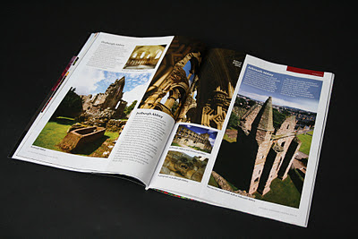
Historic Scotland magazine which I design on behalf of Think Publishing has been shortlisted for tonight's APA awards in the Best Public Sector/Government Title category.
Good luck to everyone at Think!
The new Winter issue features modern public art in Glenrothes, a celebration of religious buildings and one man's quest to visit every one of Historic Scotland's island based monuments.


Good luck to everyone at Think!
The new Winter issue features modern public art in Glenrothes, a celebration of religious buildings and one man's quest to visit every one of Historic Scotland's island based monuments.


National Planning Policy Framework is fundamentally flawed says Countryside Voice
The latest issue of Countryside Voice, the member magazine for the Campaign to Protect Rural England has been published by Think. The magazine, which I design, persuasively campaigns against the government's National Planning Policy Framework. Also inside are features on delicious regional food, modern farming champions and landscape photography.


Thursday, 10 November 2011
Had its chips
While visiting a client in Rugby I walked past a chippy that had closed down. I loved the faded typographic design.


Attention! Redesign and training for Equipped magazine
A quick redesign and training meant Equipped magazine's new look was sent to the printers on time. I spent a week in their Glasgow office working with MD David Riddell and editor Jenny Hjul to pull together the new issue with-first time designer Blair Carrick.
Equipped (formerly EQPD) offers the armed forces and its veterans advice and help with property, finance, lifestyle, resettlement and education, training and employment. It is distributed to all ranks, veterans and their families.

Equipped (formerly EQPD) offers the armed forces and its veterans advice and help with property, finance, lifestyle, resettlement and education, training and employment. It is distributed to all ranks, veterans and their families.

Thursday, 3 November 2011
Escape Winter
The Winter issue of Escape, the First Great Western free passenger magazine can now be picked up on trains in the South West and London.
Designed on behalf of Think Publishing


Designed on behalf of Think Publishing


Tuesday, 1 November 2011
The Adventures of Bradley and Friends for Red Kite
I designed a 12 page 'bible' to promote a new animated series called 'The adventures of Bradley and friends' for Redkite.
The Adventures of Bradley and Friends is a CGI animated, pre-school series that follows the adventures of a lively young boy on his travels to story worlds from around the globe.

The Adventures of Bradley and Friends is a CGI animated, pre-school series that follows the adventures of a lively young boy on his travels to story worlds from around the globe.

Tuesday, 25 October 2011
PPA Scotland Awards Shortlist Announced

The PPA Scotland 2011 Magazine Awards shortlist was announced today with a few magazines I'm involved with included in the selection.
Boots & Spurs The National Clarion member magazine has been shortlisted for member magazine of the year and best professional and business magazine design.
My redesign for TESS (Times Educational Supplement Scotland) has been shortlisted for best magazine cover and best business and professional magazine. Congratulations to TESS editor, Gillian Macdonald who has been shortlisted in the best business and professional editor catagory
Congratulations also to Think Publishing who have been recognised in a number of categories. The Biologist (I designed the winning pitch) is shortlisted for best business and professional magazine. Discover NLS, the National Library of Scotland magazine and Escape, the First Great Western passenger magazine (both of which I design) have been shortlisted for best customer magazine. In the best member magazine category Historic Scotland (which I design) has been shortlisted. Think's John Innes has also been selected for the publisher of the year award.
More information on the PPA website
Monday, 3 October 2011
Use the 'hotspot'
The hotspot is the only part of the cover that guarantees visibility. It makes up the 5% of cover space at the top left hand corner and is visible when magazines are stacked with either the left hand or top of the cover is in view.
The latest issue of the redesigned Fly Fishing & Fly Tying magazine uses the hotspot to sell the magazine's core values:

The latest issue of the redesigned Fly Fishing & Fly Tying magazine uses the hotspot to sell the magazine's core values:
- '17 NET BUSTING FLY PATTERNS'. The language is bold and the number adds value to the magazine, there is a clear benefit to buying the magazine.
- The image of the fly is aspirational, something the reader can achieve.
- The inset of an expert tying a fly shows the magazine will help its readers achieve a goal.

Tuesday, 27 September 2011
Escape to victory
The latest issue snapped on a First Great Western train...
The cover template is built to accommodates the design of the holder, ensuring good visibility.
I design the passenger magazine on behalf of Think Publishing.

The cover template is built to accommodates the design of the holder, ensuring good visibility.
I design the passenger magazine on behalf of Think Publishing.

Monday, 26 September 2011
Countryside Voice
The Summer issue of Countryside Voice, the member magazine for the Campaign to Protect Rural England brought readers a breath fresh air last month, now working on the Autumn issue for Think publishing.


Wednesday, 14 September 2011
Fly Fishing & Fly Tying redesign
Mark Bowler, Editor of Fly Fishing and Fly Tying, asked me to redesign his monthly magazine.
I worked with Mark in 2007 on a new logo for the magazine and introduced new fonts, so it was great to be asked back to have a look at the inside too.
Here is a sneak peek at the new look.


I worked with Mark in 2007 on a new logo for the magazine and introduced new fonts, so it was great to be asked back to have a look at the inside too.
Here is a sneak peek at the new look.


Quality work!

Congratulations to Think Publishing who used my designs on the winning pitch for UK Excellence, the British Quality Foundation member magazine.
Friday, 9 September 2011
How 4 magazines stuck to their core personality when responding to 9/11
If your best friend's personality dramatically changed, you'd get confused, maybe put off and perhaps stop seeing each other.
The same goes for magazines brands. Every magazine should have a unique and consistent personality, a voice through which it tells its stories. Editors and designers should treat these values with care, any modification could lead to an alienated readership.
The production of every element of a magazine should be dictated by its core personality traits. Tone, angle, design, story and picture choice should be led by a magazine's brand values, making it easier to decide what should and shouldn't be published. Translated to the point of sale, regular readers will be able to recognise the magazine quickly and new readers will understand what the magazine is all about immediately.
Understanding a magazine's core personality is vital when responding to extraordinary circumstances.Ten years ago I was living and working in New York as an art director for Popular Science magazine. Magazines responded to the attacks in many ways. Here I highlight how 4 titles displayed their core personality to present the 9/11 attacks in completely different ways.

TIME
Time produced a special one-off issue. Time is a news weekly and its cover reflects this. Lyle Owerko's image shows exactly what happened - the reality and horror of the plane crashing into the the South Tower at 9.03am.

VANITY FAIR
The glossy celebrity monthly is an insider's view to the world of pop culture and current affairs. It puts celebrities on a pedestal and treats readers to lavish, superbly lit photographs by top photographers like Annie Leibovitz, Mario Testino and Herb Ritts.
Vanity Fair's quick reaction to the attack was a one-off special edition. Jonas Karlsson set up a temporary studio at ground zero and photographed the emergency workers in grainy black and white. A style that presented the workers as heroes, photographed in the same way Vanity Fair would present a celebrity in its pages

NEW YORKER
An intellectual weekly magazine that reviews, comments and satirises contemporary culture and current affairs. Every issue features an illustrated cover by a well known artist. The September 24th issue featured Art Spiegelman's silhouetted twin towers. A poignant homage to those lost at ground zero. At first glance the cover looks completely black, but on closer inspection the 5th colour black reveals the ghostly outline of the towers.

ROLLING STONE
Launched in 1967 by Jann Wenner, Rolling Stone mixes rock music, politics, comment and culture from a left-leaning standpoint. The magazine is still heavily influenced by its owner-publisher, his personality runs though out each issue and he still signs off the magazine.
In the days after 9/11 many Americas started wearing a stars and stripes lapel badge to show their unity and patriotism. Jann Wenner was no different. Struggling to find a suitable cover image, Jann had his 'flag pin' photographed by Davies + Starr on a simple white background.
All four magazines stuck to their core values when responding to the world changing events of September 11th 2001.
Local interest in 9/11
My local newspaper, the Linlithgow Gazette, asked me to write a short piece for this week's issue after the editor read my blog post recounting my experience of 9/11:
"It shows how innocent the times were that I wasn’t concerned about smoke billowing into the sky as I commuted to my job as an art director. But at work I found my colleagues glued to the TV - a plane had crashed into the Twin Towers.
My wife Kirsty and I had been living in New York for 18 months on September 11th 2001; we felt like we were just settling in.
For 17 minutes everyone thought a private plane had accidentally crashed into the North Tower.
At 9.03 the world changed. We witnessed the killing of hundreds of innocent people live on TV as the second plane hit the South Tower.
As the horror unfolded it became obvious that thousands would die - the World Trade Centre contained more people than live in Linlithgow.
Afterwards the air was filled with a sickening smell, heartbreaking home-made missing person posters fluttered everywhere and The Stars and Stripes appeared outside homes and flew for the remaining 3 years we lived in America.
Americans disagreed on how to react but as phrases like “War on Terror”, “Axis of Evil” and “WMD” entered the language it was clear how the World would respond.
A decade ago I could not have imagined that the events of that Tuesday morning would play such a significant role in our lives today."
Latest issue of National Clarion Member Magazine in the post
Boots & Spurs, Britain's largest cycling club member magazine is now in saddle bags across the country. We publish the magazine on behalf of the National Clarion Cycling Club twice a year.
This season's cover illustration by Garry Marshall proudly display's the club's success in getting young riders out cycling.
The club has almost doubled its membership in the the last two years.
The latest cover has featured on a number of blogs recently. Garry's illustration struck a chord with many taste-setters including Robert Newman, Claudio Franco at nascapas and Japp Biemans at Cover Junkie
Click the links to see the blogs:
coverjunkie.com
nascapas
newmanology
Thursday, 8 September 2011
Historic Scotland Autumn issue out now!
The latest issue of the Historic Scotland member magazine will soon drop through readers' letter boxes. This season's issue features stunning photos of Edinburgh's past, a revealing behind the scenes look at how actors prepare to play characters form Scotland's history and an extraordinary glimpse at one of the first newspapers, the Melrose Chronicle.
Designed on behalf of Think Publishing

Designed on behalf of Think Publishing

Pick up a summer issue of Escape on First Great Western Trains
The latest issue of Escape, the First Great Western passenger magazine is jam-packed with things to do around the South West and London.
Designed on behalf of Think Publishing

Designed on behalf of Think Publishing

Monday, 5 September 2011
9/11 remembered: my eye witness account

I continued with my commute on the 6 train to my stop at 32nd Street and Park Avenue, headphones on, reading a magazine. My normal exit out of the station was chained shut, so I continued to the exit on 33rd street and headed into my office on the 9th floor of 2 Park Avenue.
18 months earlier I'd managed to bag a job in New York. I'd been working for emap in the UK as a magazine designer in their Peterborough office and decided I wanted to work in the States.
I sent letters and photographs of my work to all the CEOs of the major publishing houses in Manhattan. A prehistoric way of getting a job compared to today's social networks, but it worked! One of my packages landed on the desk of Efrem Zimbalist III, the head of Times Mirror magazines (TMM).
TMM were looking to launch a golf magazine. I'd been working on the now defunct Fore! and Efrem liked my work. Coincidentally, Popular Science, also owned by TMM were looking for an designer, so when the golf project was shelved Efrem handed my portfolio to Chris Garcia, Popular Science's Art Director.
As I walked onto the editorial floor of Popular Science on Tuesday September 11th 2001 there was a commotion in an advertising executive's office. A few of my colleagues were staring, opened mouthed, at the TV. A plane had hit one of the twin towers.
At this stage it was assumed to be an accident, perhaps a private plane that had gone off course. I had a brief chat, took in the news flash and then continued to my desk and got ready for the day ahead.
The magazine was on press and we had a lot to get through. I was waiting for delivery of the contact sheets from a photo shoot on Long Island with photographer Robert Mayer. We'd been photographing Christopher Langan, "the smartest man in America", in bar, because he used to be a bouncer there.
Screams suddenly erupted from the Editors' offices - another plane had crashed into the World Trade Centre.
Shocked staff started to congregate into one of two offices to watch the attack playing out, Democrats in the editor's office and the more hawkish Republicans in the advertising chief's office.
I was friends with people in both camps so switched between the two rooms for a while. The hawks were beginning to sound too aggressive for my liking and the editor's office was packed.
I felt like an outsider, detached, it wasn't my country. I didn't really know what to do so I went back to my desk and got on with work, for me the best way to cope with the enormity of the situation.
I don't think American TV was broadcasting the same footage as that seen in the UK. Talking to British friends later, it seems the BBC was showing far more horrific imagery than what we were seeing in New York.
Later on, more loud screams. I rushed over to the editor's office to see the first tower collapse. Staff were alarmed and fearful. Many planes were still unaccounted for and we'd heard the Pentagon had been hit. Our building was two blocks away from the Empire State Building so we were worried there could be another strike close by. America hadn't been attacked since Pearl Harbour, we felt incredibly vulnerable.
Colleague, Gunjan Sinha, was anxious. Her husband, Manolo, worked in one of the Twin Towers, he was unaccounted for and she couldn't get through to him on his cell phone.
By 11.30am there was news. Manolo was alive! He'd gone to an early meeting up-town and arrived at the World Trade Centre later than normal, to witness people jumping, he left the scene immediately.
By the time the second tower fell the decision was made to send people home.
I'd managed to get in contact with my wife Kirsty in Brooklyn and friends and family in the UK to say I was OK. But I was stuck on Manhattan, the subway was closed and although millions were walking across the bridges back to their homes in Brooklyn I felt safer staying put in the office.
By mid-day, Editor, Cecilia Wessner and I were the only staff on the floor. We carried on getting the magazine to press. I spent the day building pages, looking at Quark Express 4.1 instead of the TV.
I got to know Cecilia a little better that day, she was already reworking the next issue. It was too late to run a 9/11 story in the present issue but she rewrote her editorial, a page not yet sent to the printers.
9 floors below me the yellow taxis had been replaced by people streaming northwards, Park Avenue was heaving with survivors making their way home.
By 8pm the subways were working so I caught the F train home to Brooklyn. From our apartment roof you used to be able to see the top of the towers, now just smoke. Kirsty, who was 5 months pregnant with our son had said debris had been falling from the sky all day around where we lived near Prospect Park, 4 miles away.
The next day the office was closed, I told Cecilia I'd help finish the magazine so I took the empty subway train to Manhattan.
The city was in mourning, street lights which normally had the odd missing pet flyer were now covered with heartbreaking home made missing person posters. There was a sickening smell that stayed in the air for what seemed like weeks. The Stars and Stripes appeared outside homes and flew for the remaining time we lived America, another two and a half years.
The attacks had a dramatic effect on magazines. Every magazine published after the attack ran a 9/11 story, however incongruous. A golfing magazine used 9/11 as an excuse to get people onto the fairways - golf was the best medicine, relieve the 9/11 stress by playing 18 holes!
Popular Science's November issue was a patriotic look at how technology will prevent future attacks - designs for terrorist proof sky scrapers with armour plating and radar, battle field drones and the future soldier were squeezed into a special 9/11 issue.
But magazines were in trouble, advertising contracted, budgets were cut, Popular Science was sold to Time-Warner. By March 2002, out of 30-odd staff, only 3 or 4 who were employed the previous September remained. Many had been sacked and replaced by the new employers, others had decided to move out of New York, back to their safer home towns.
I was leaving too, Rolling Stone had called and offered me a job on the design team so it was time to move on.

Monday September 10th 2001, Long Island photoshoot. Polaroid by Robert Adam Mayer
Wednesday, 17 August 2011
10 tips for a great cover
The PPA asked me to write the criteria for a new award category - best magazine cover
Here are my top 10 tips for what makes a great news stand cover
1. An image that says "pick me up"
2. A memorable logo.
3. A catchy slogan/strap line.
4. Use the cover space effectively, the top left and leading left edge are prime positions.
5. Colours should be bright. Avoid black and dreary colours.
6. Engaging cover lines that appeal to both new and core readers.
7. Cover lines that are active, add value and offer a reward.
8. Keep it simple: language and concepts must be immediately understandable and shouldn't need decoding.
9. Use a selection of cover line styles (both graphic and and written).
10. The cover should consistently convey a magazine's unique personality from issue to issue.
Monday, 15 August 2011
My Commute

You don't get a commute much better than this. I was on my way to visit a client in the Scottish highlands and had time to stop and take this early morning snap.
Subscribe to:
Posts (Atom)